shapes and sushi
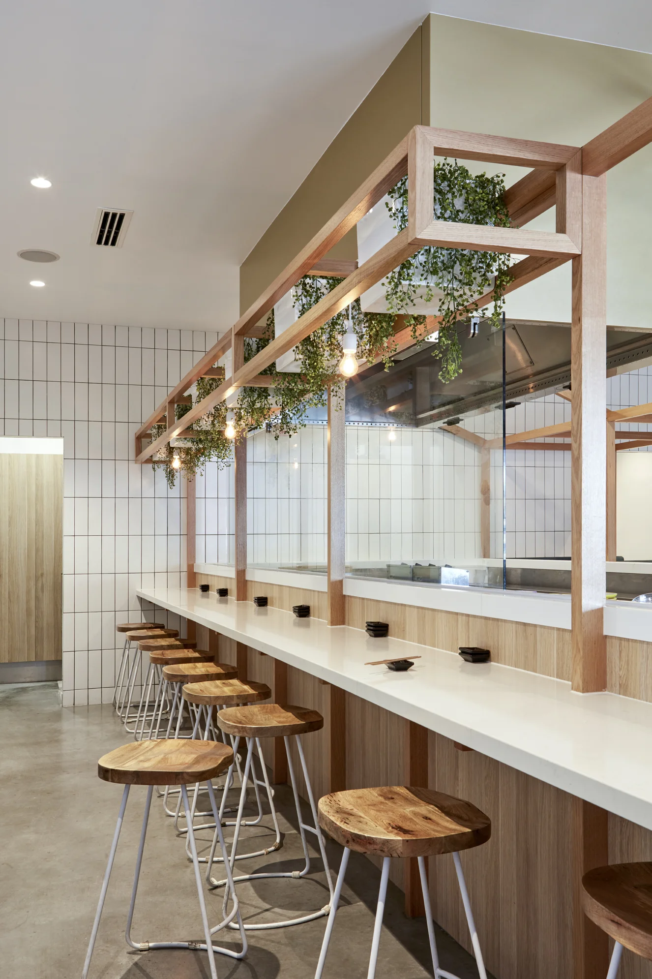
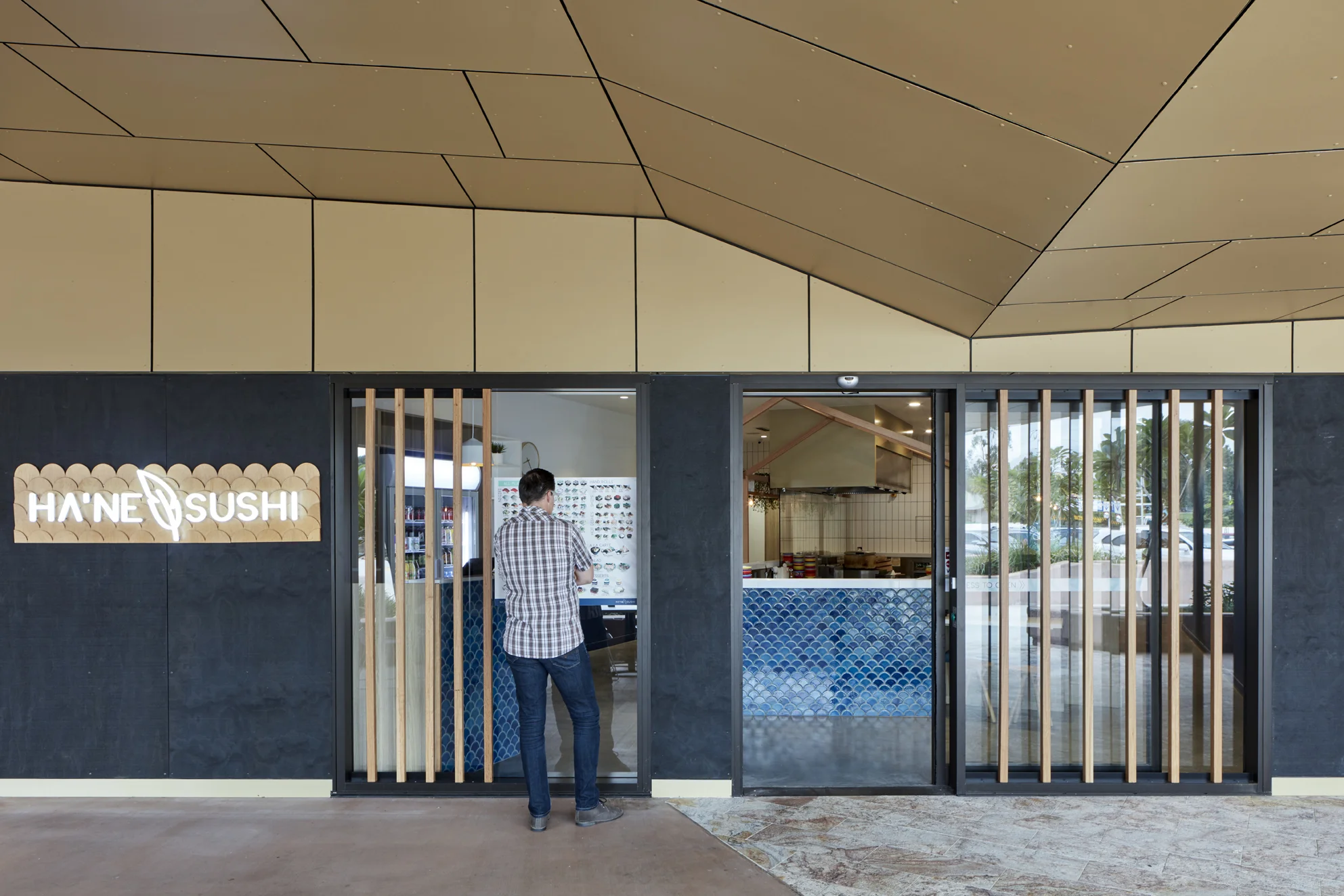
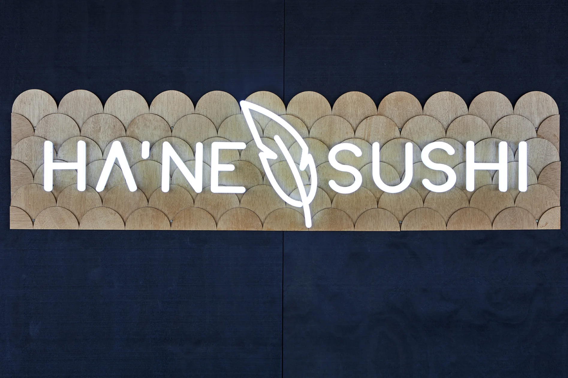
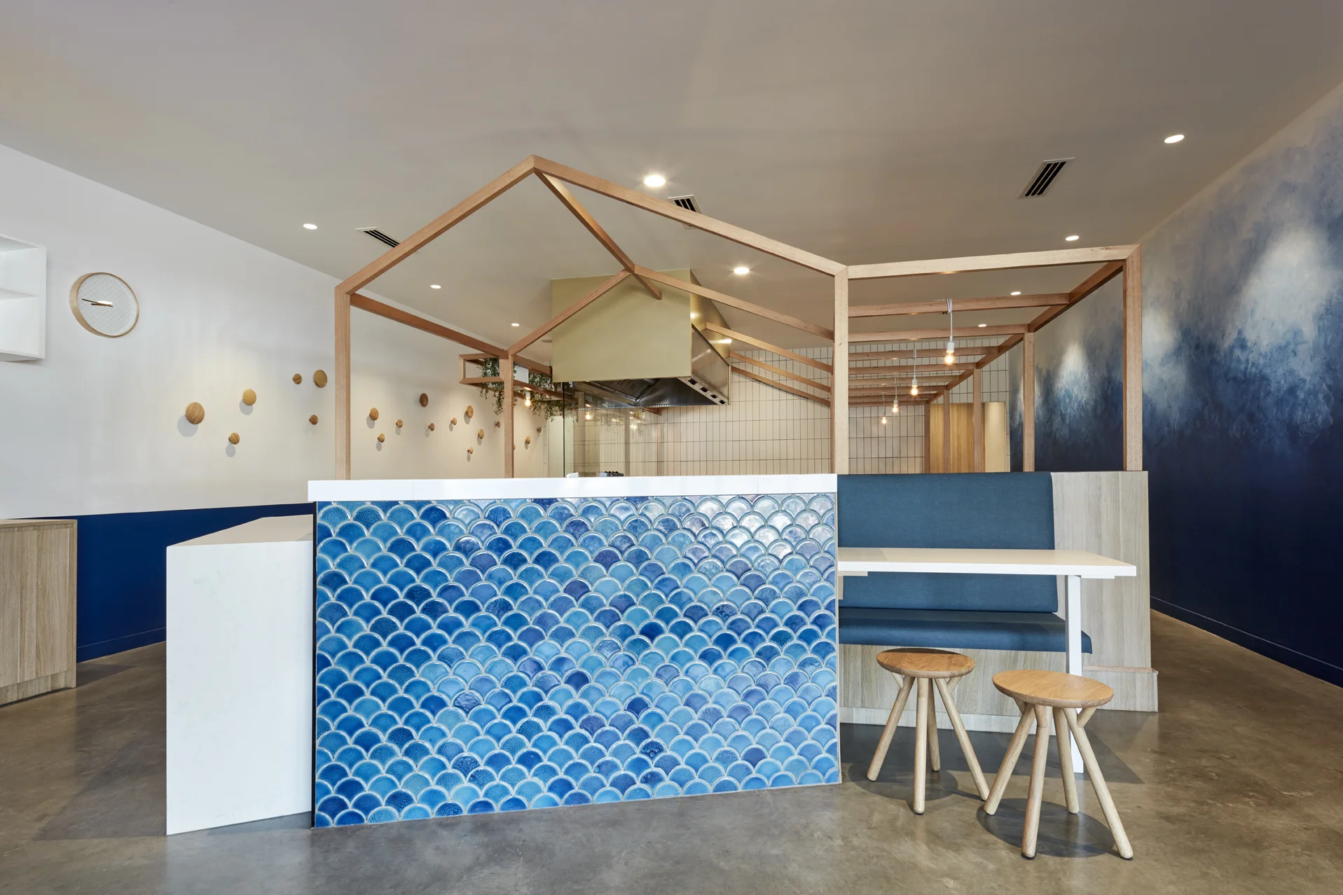
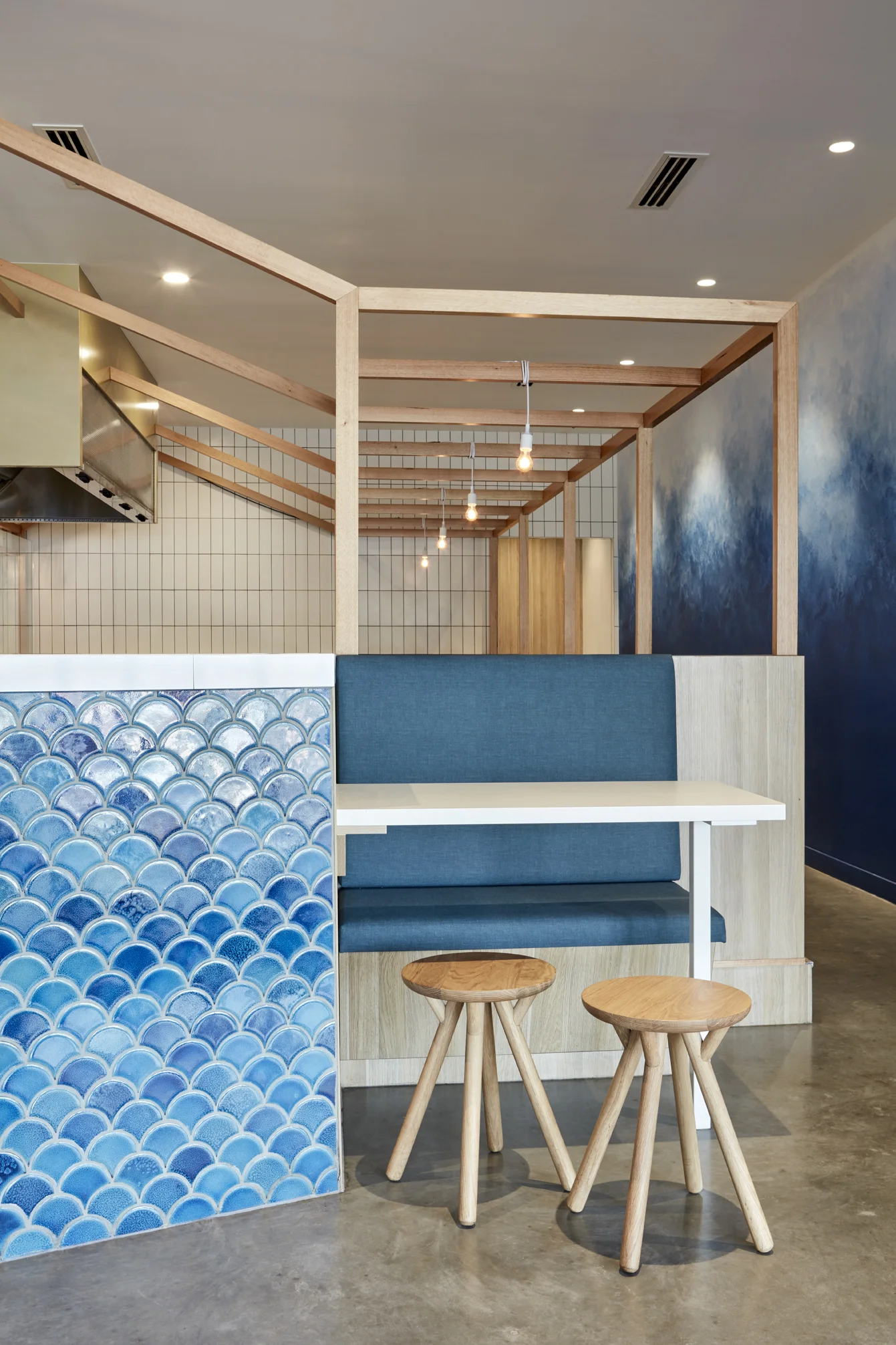
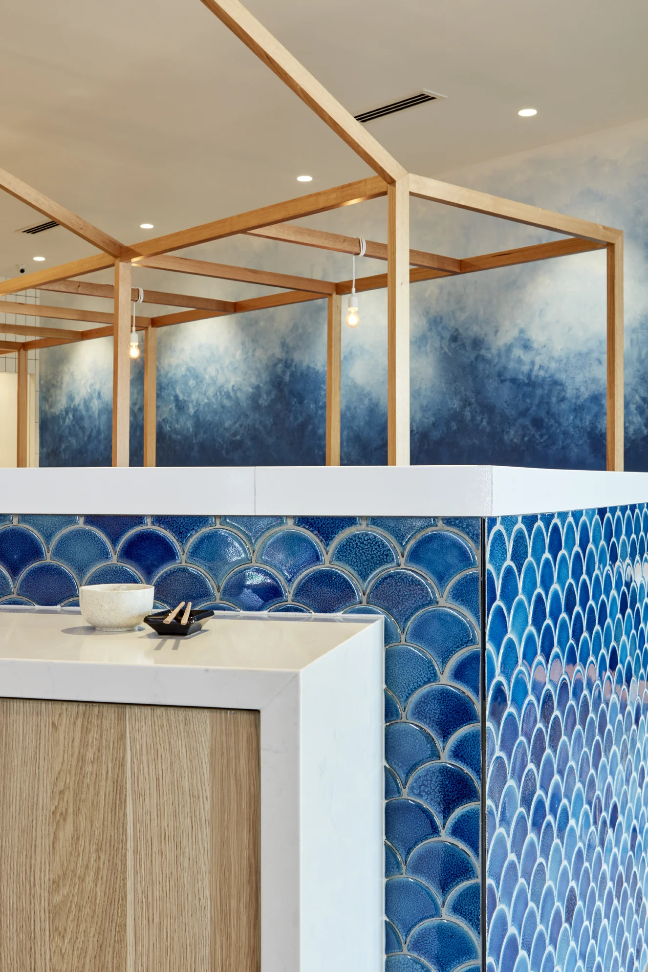
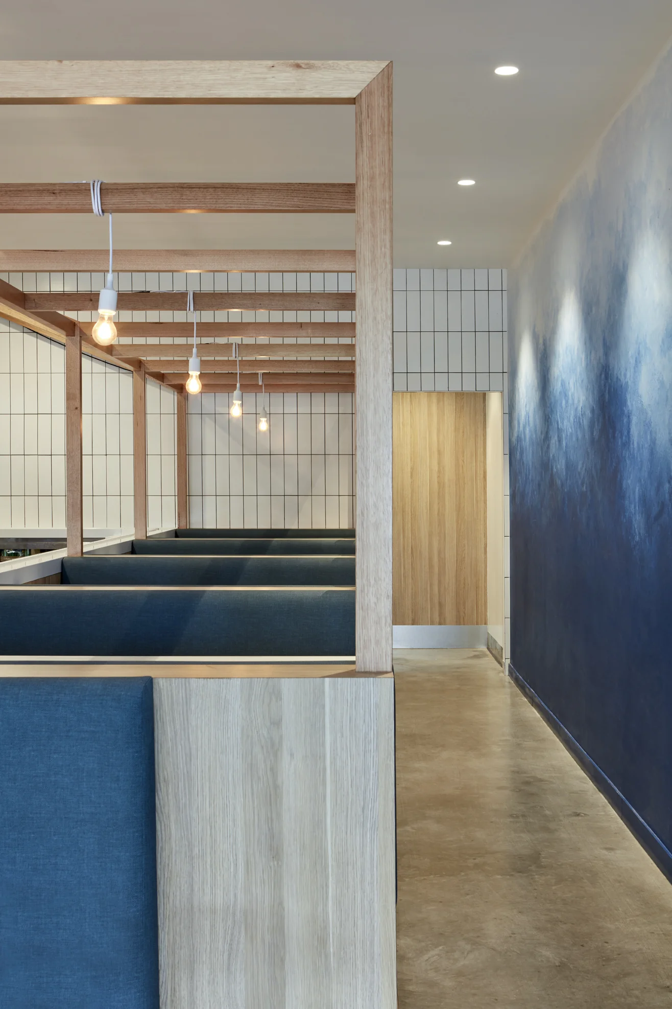
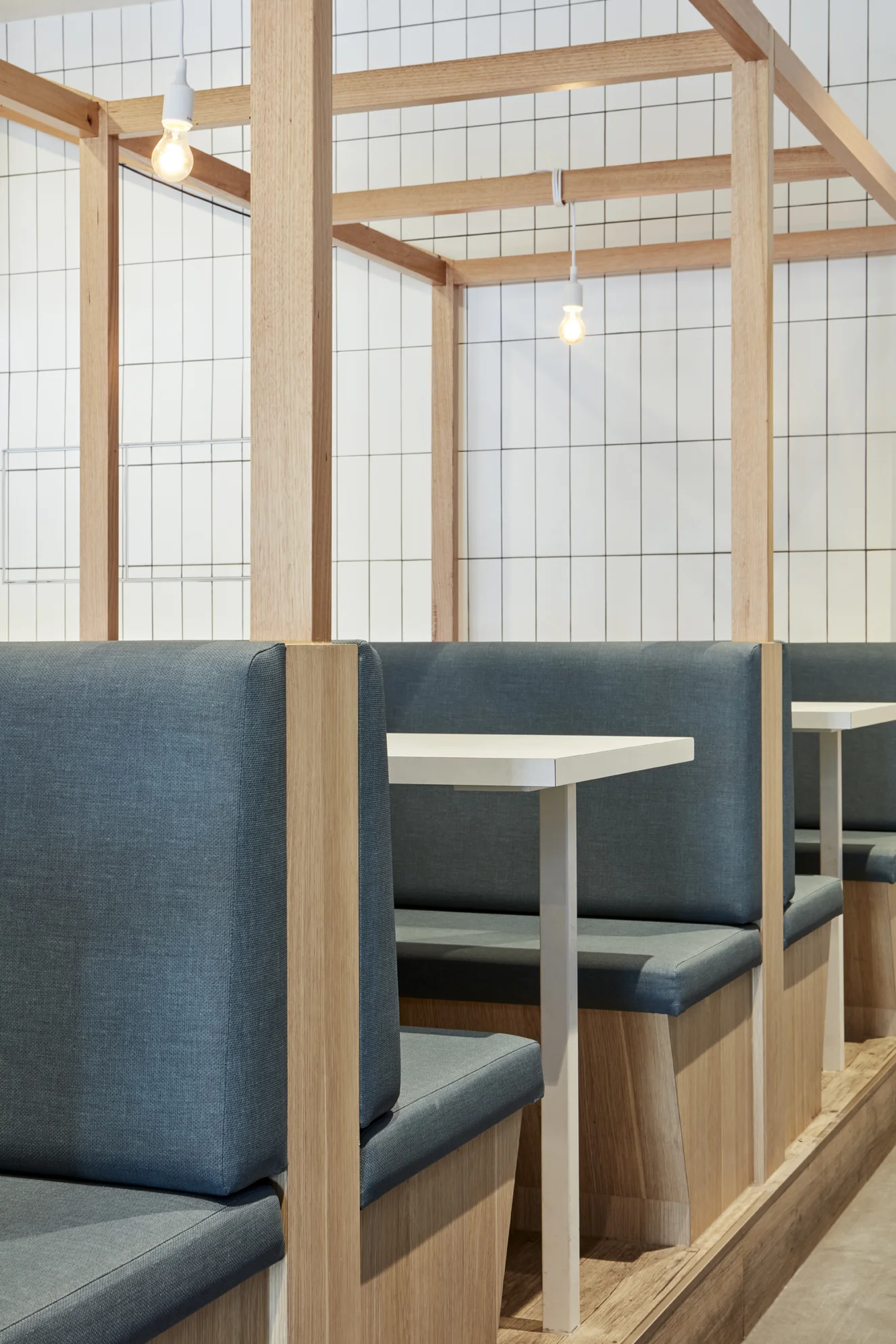
The brief for Hane Sushi was simple, just like the design intent - design a fresh, clean, contemporary and simple setting for a new sushi train restaurant in Eaton’s Hill Village. We worked closely with the client to develop a paired back, light and airy aesthetic, quite different from other Sushi Restaurants they had done before. By keeping the material palette and colour selections minimal, we were able to work within the client’s budget. We carefully selected finishes that enhanced moments in the plan, like the warm Tasmanian oak timber frame over the sushi bar, which really works to frame the action going on within the sushi bar, and highlight the food on the sushi train. While the organic nature of the varied coloured blue fishscale tiles, bring in an element of fun and delight, and works to draw you into the space.