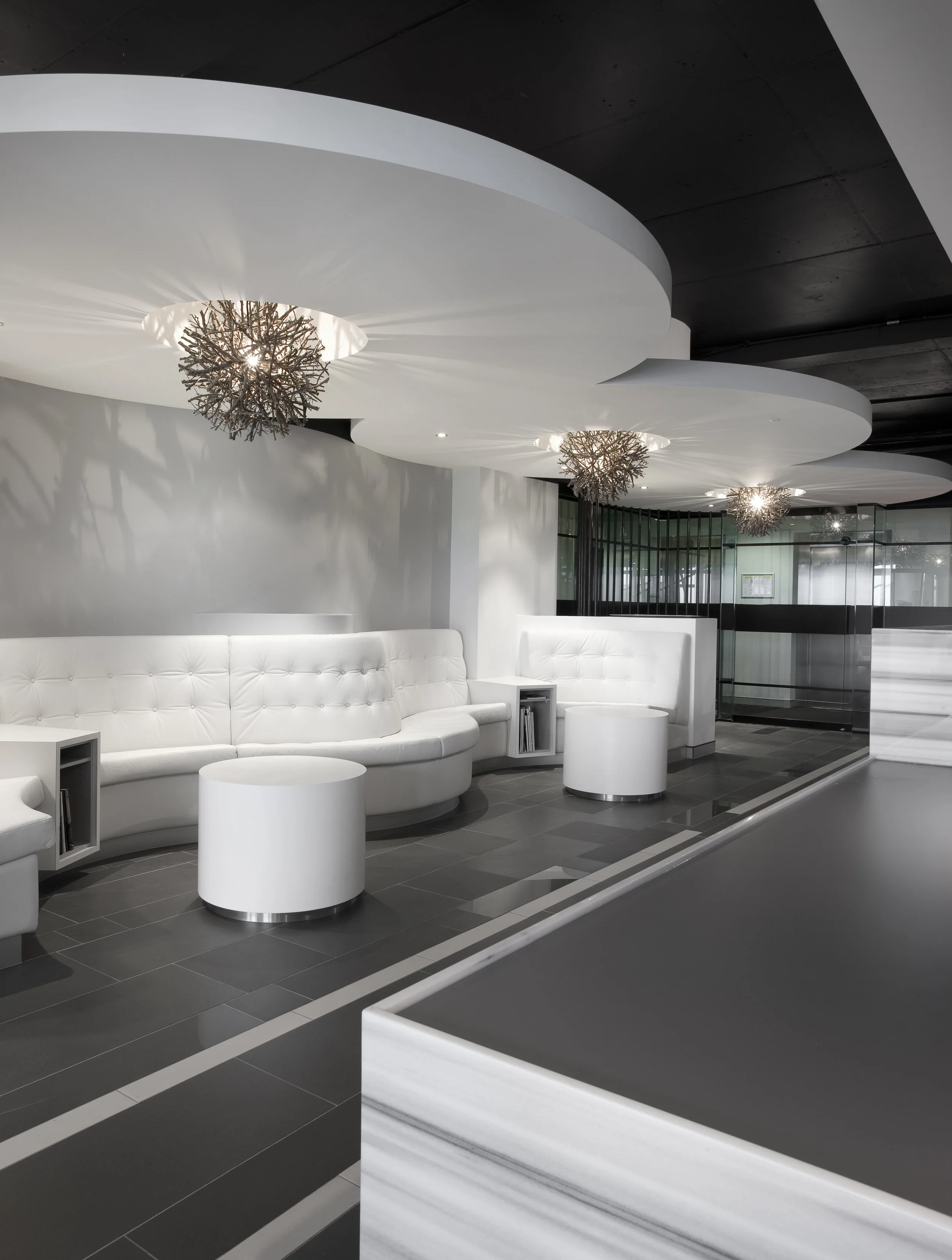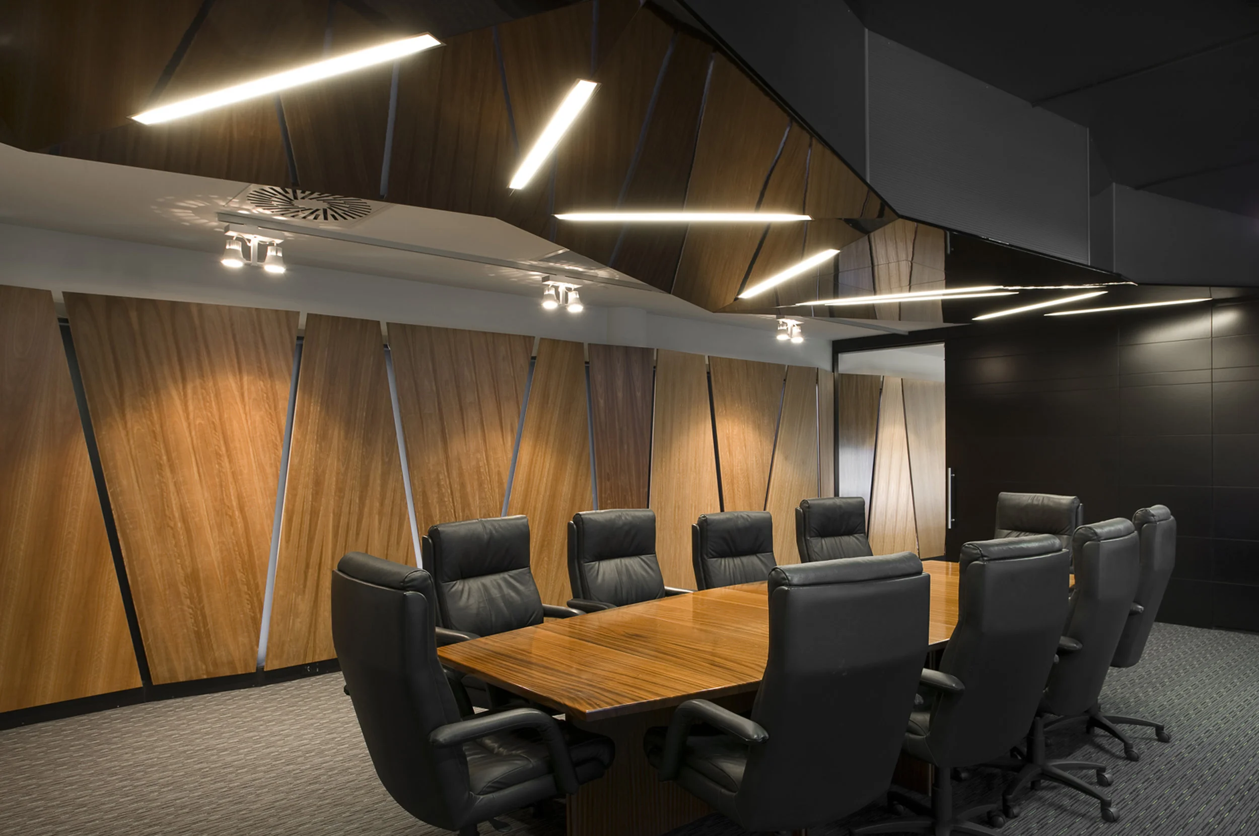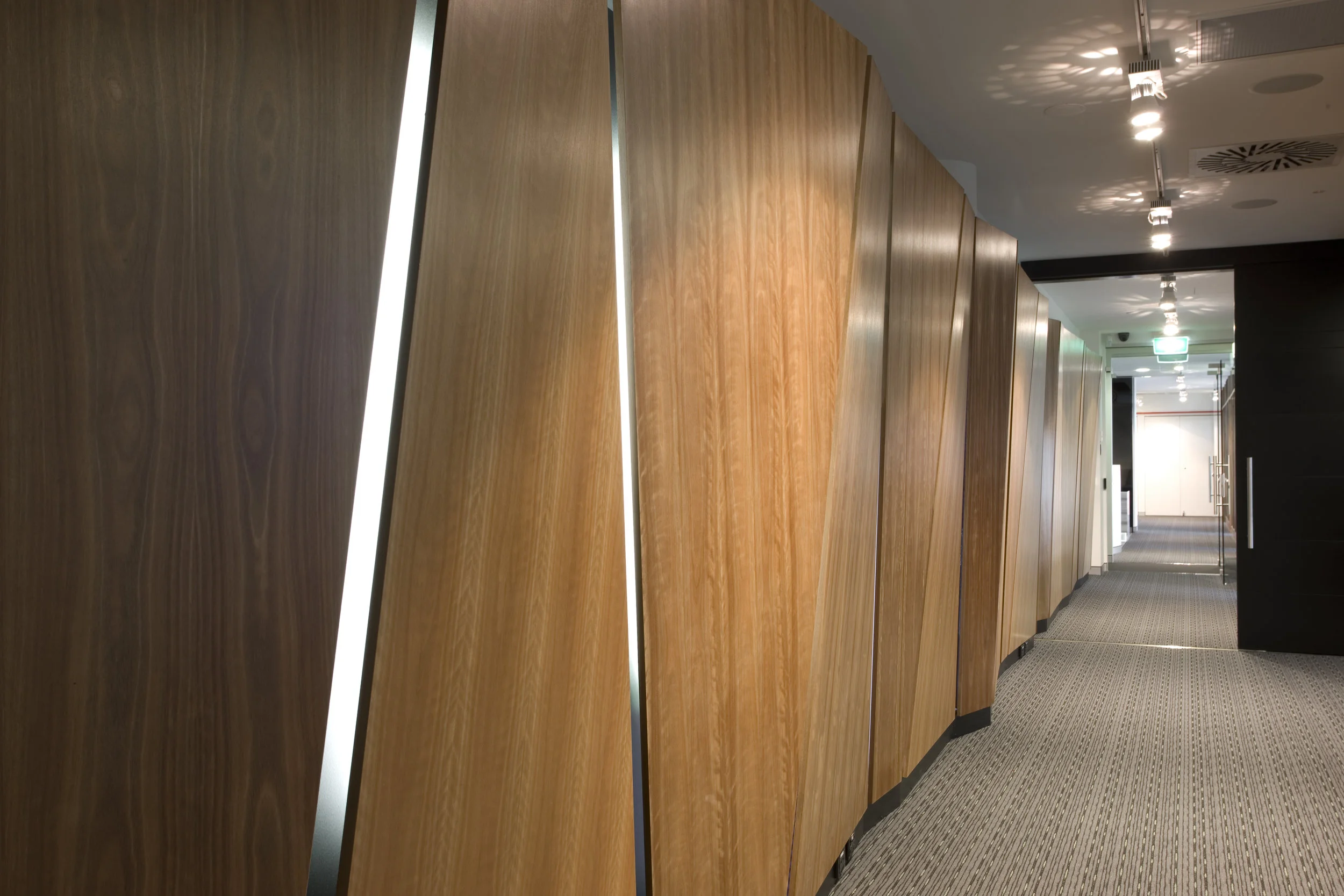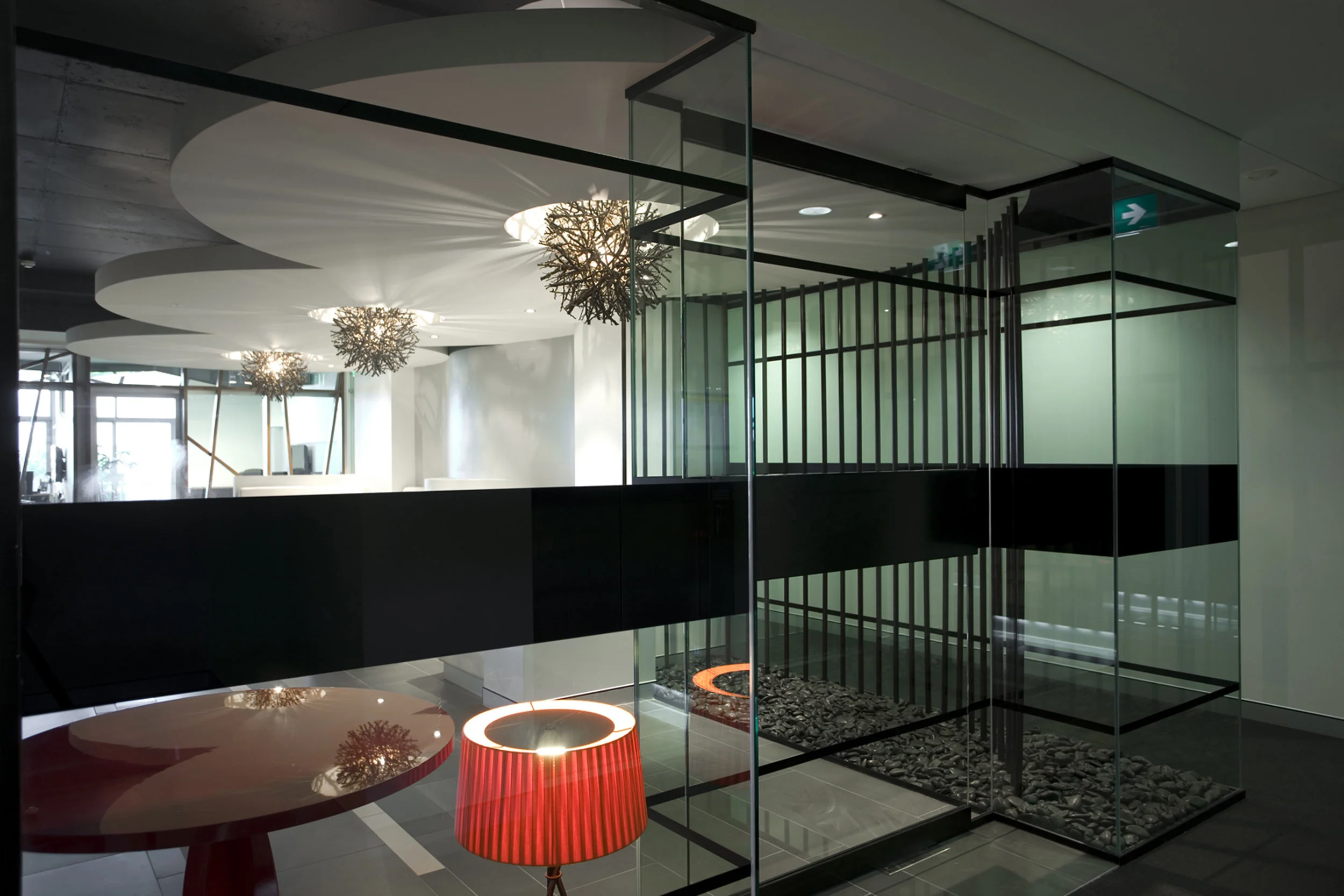
nostalgia and light
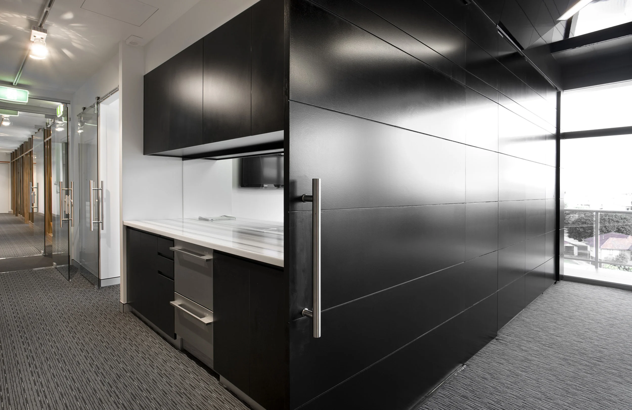
With a logo which is derived from the plan view of a diamond and mantra of ‘above the line’. TONIC dissected the essence of these metaphors and conceptualised design outcomes. ‘Refractions of light’and‘above the line’ informed aesthetic style elements,like faceted surfaces, reflection and linearity both straight and skewed. A lasting and significant first impression for clientele was important. Hence it was imperative that quality of space be realised, when entering an organisation of such substance. The re-branding and new invigorating workplace environment which inspired clientele and staff.